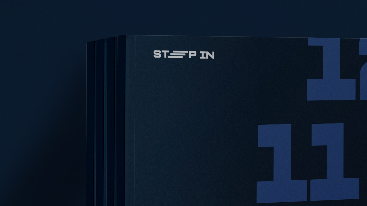
I was commissioned to develop the identity for STEP In, the youth-focused expression of the STEPS course. The objective was to cultivate a more youthful energy while maintaining a clear visual lineage to the parent brand.
The identity is anchored by Protrakt Variable, a typeface that is inherently structured yet approachable. Its clean lines and minimal contrast provide the versatility required for a multi-platform rollout. To reinforce the course’s core concept, I modified the ‘E’ to form a step—a literal and figurative representation of the journey the participants undertake.
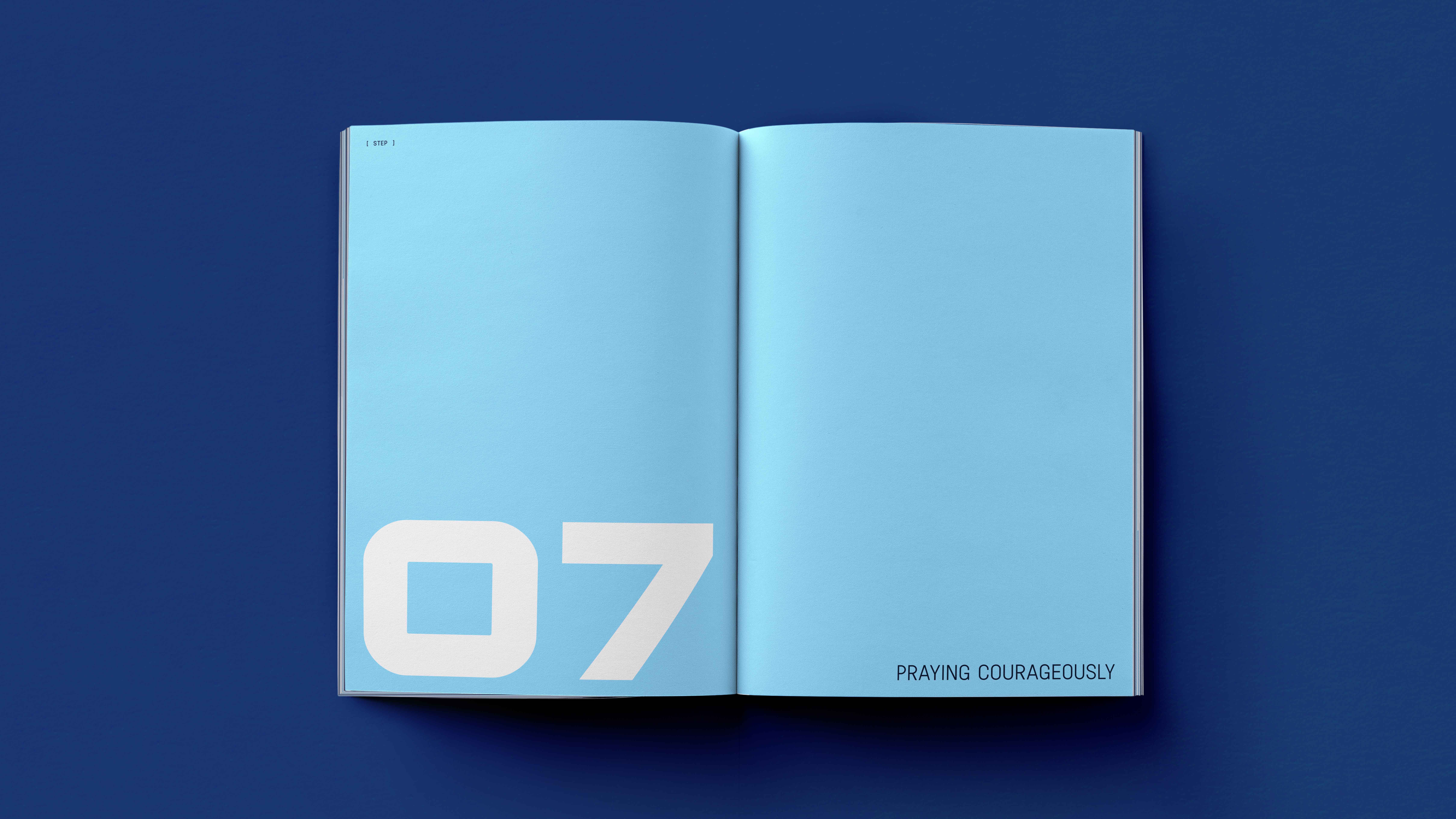
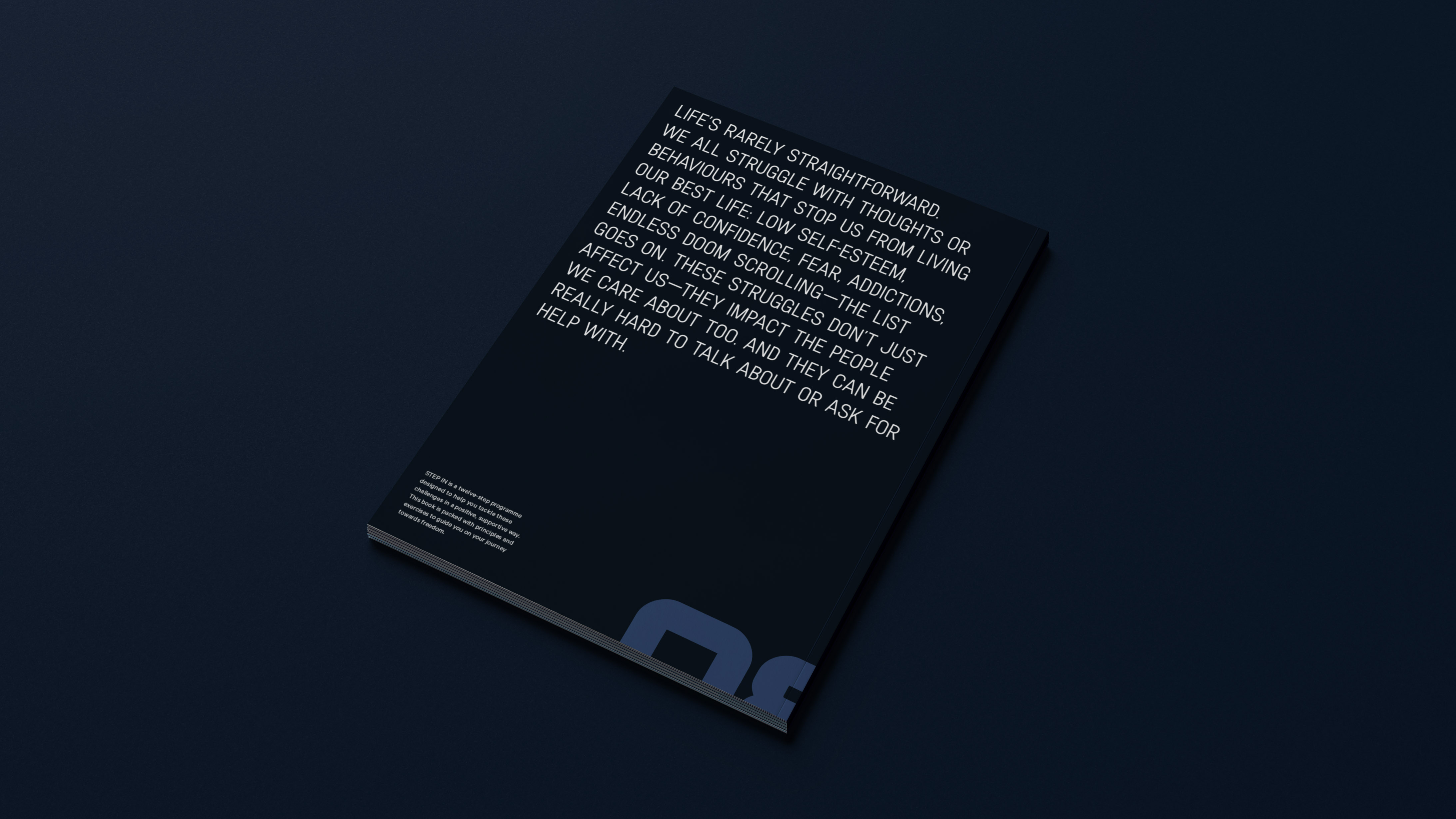
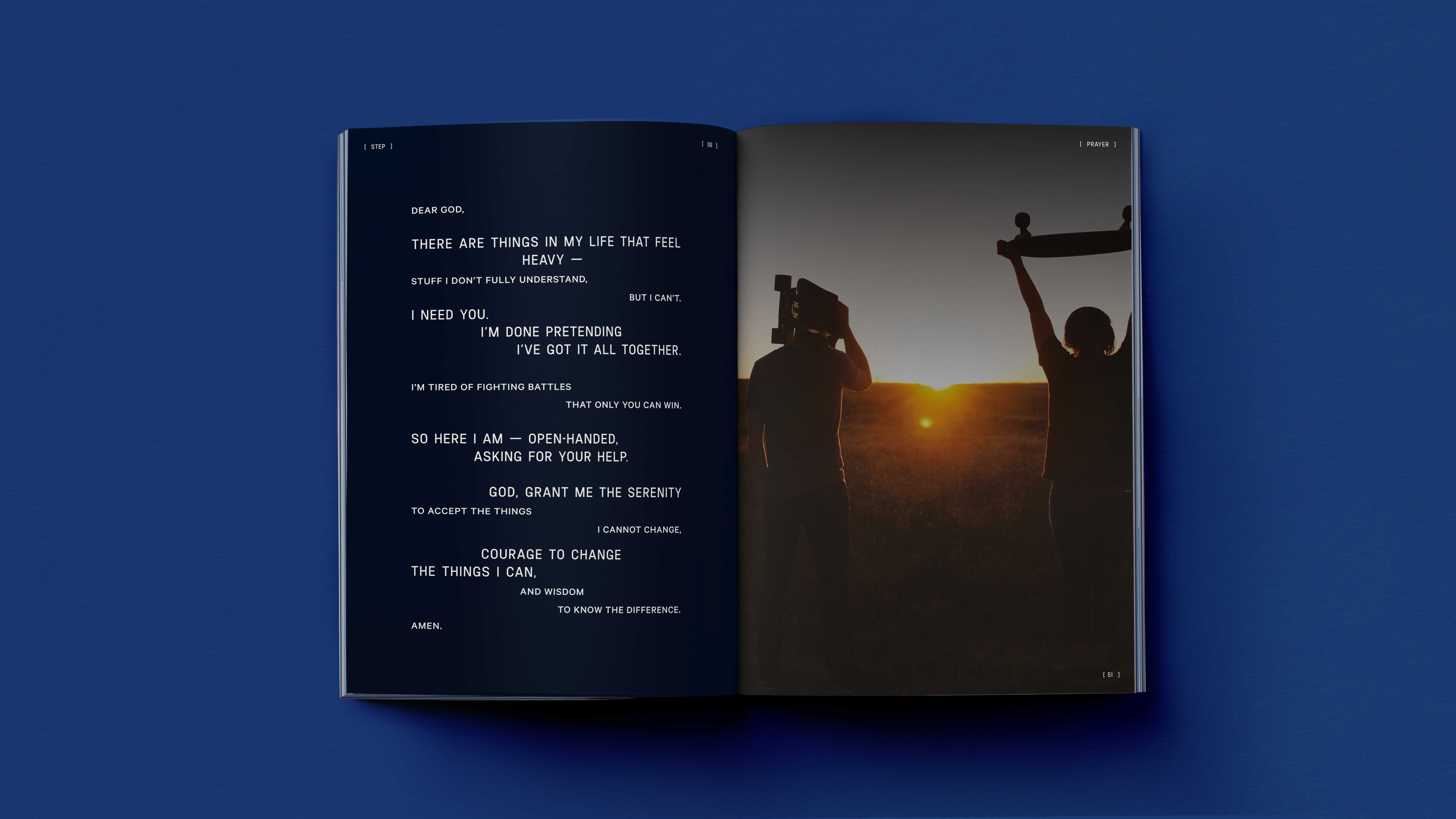
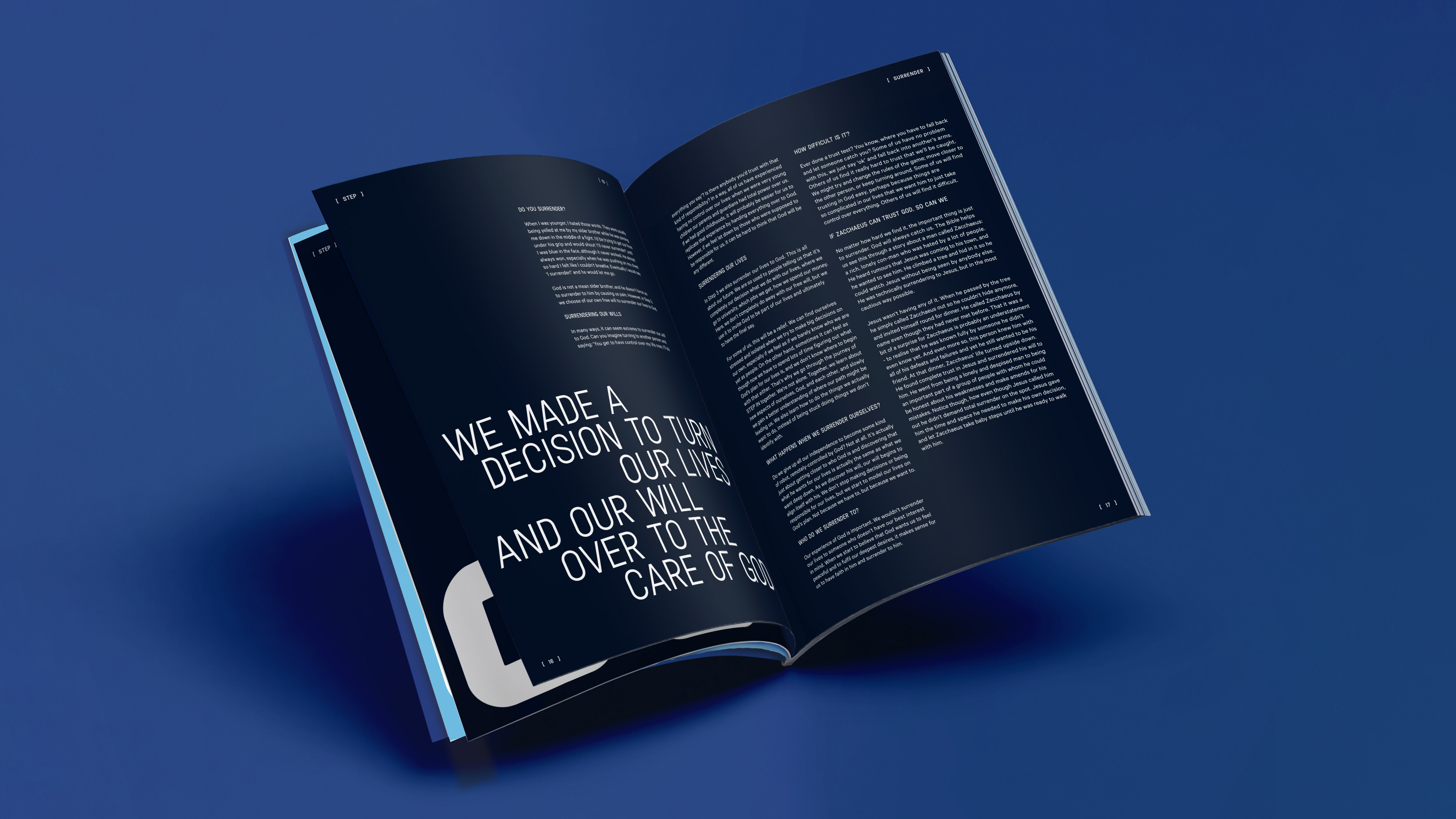
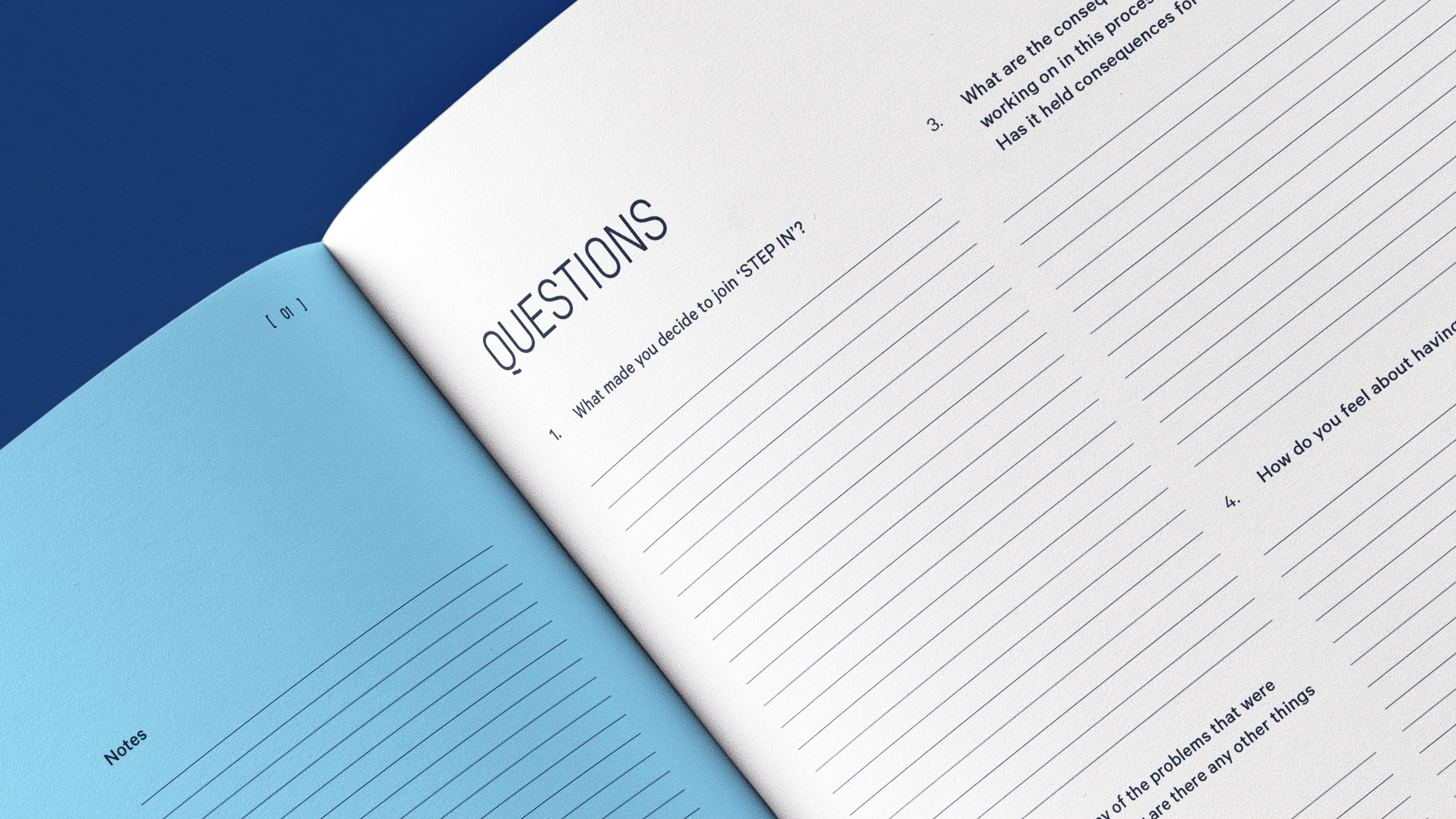
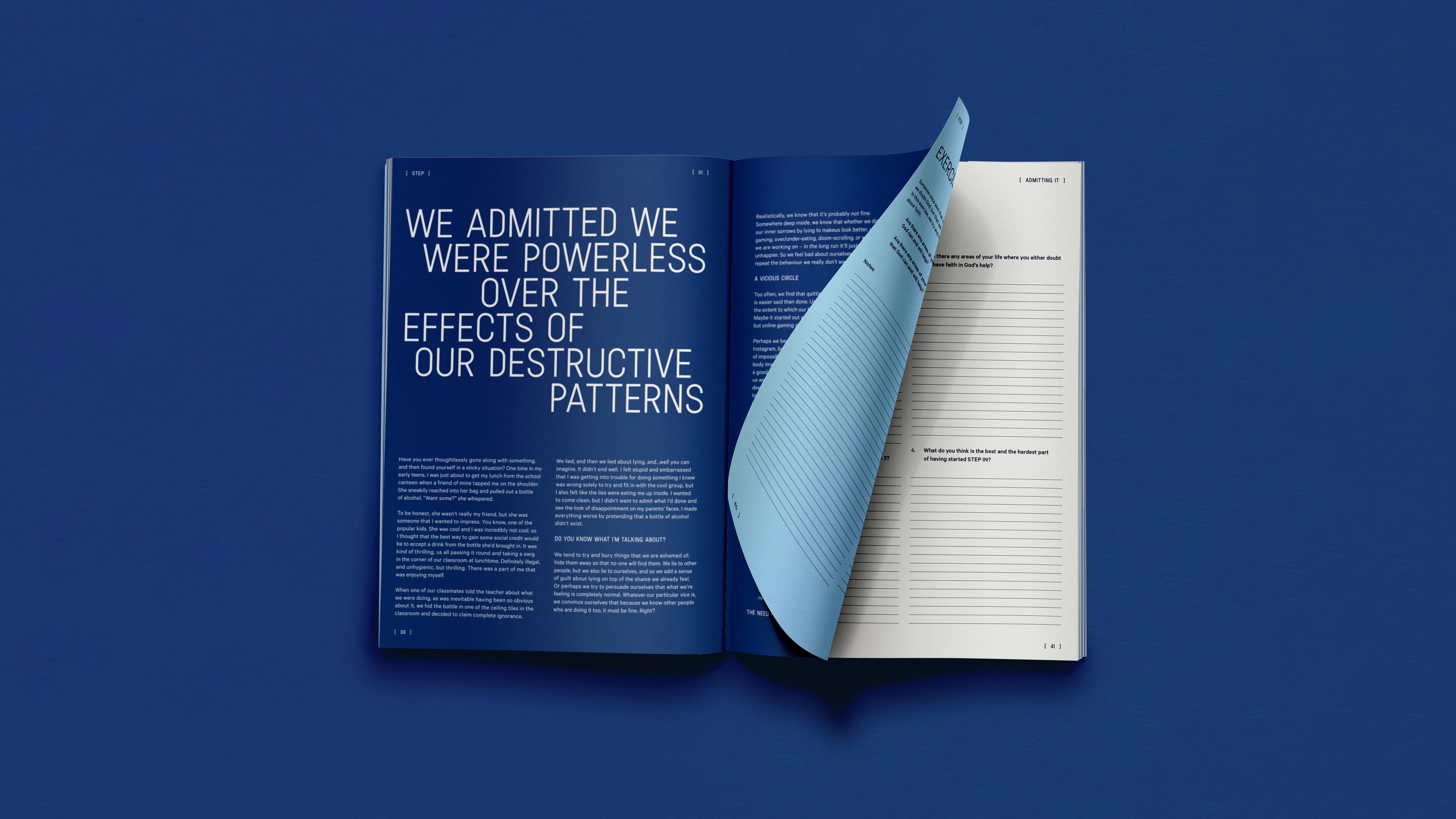
The workbook serves as a physical extension of this new identity. While the signature blue palette was retained to reflect the spectrum of emotional exploration, the layout was reimagined to be bolder and more dynamic. I introduced brackets as graphic accents to inject a subtle, "engineered" energy—achieving a tone that feels slightly more masculine and structured while remaining entirely engaging for a younger audience.
.gif)
